Recent Tricks
Showing posts with label Image Mouse Hover Effects. Show all posts
Showing posts with label Image Mouse Hover Effects. Show all posts
FREE CIRCLE HOVER EFFECTS WITH CSS TRANSITIONS
Labels:
Hover Effects,
Image Mouse Hover Effects,
Jquery
FREE HOVER AND CLICK TRIGGER FOR CIRCULAR ELEMENTS WITH JQUERY
Labels:
Hover Effects,
Image Mouse Hover Effects
How To Add Lightbox Effect To Blogger
Lightbox is a simple, unobtrusive script used to overlay images on the current page. The Lightbox effect is useful when your post has many images or images with large sizes, it helps people to save time browsing images in an impressive way. We’ll see how to add Lightbox effect toBlogger (blogspot) blogs.
We are going to use the jQuery Lightbox plugin for Blogger. And before going into detail, you might want to see Lightbox in action (click on the image above to enlarge).
How to install
Login to Blogger Dashboard, go to Design, Edit HTML:
Add the following code right before the
</head> tag:
- <link href="http://rilwis.googlecode.com/svn/trunk/blogger/lightbox.css" media="screen" rel="stylesheet" type="text/css" />
- <script src="http://ajax.googleapis.com/ajax/libs/jquery/1/jquery.min.js" type="text/javascript"></script>
- <script src="http://rilwis.googlecode.com/svn/trunk/blogger/lightbox.min.js" type="text/javascript"></script>
This will add the CSS and JS files into your template. These files are hosted in my Google Code project, but you can download them (with links above) and save into your favorite host.
How to use
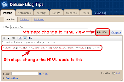
Once you’ve done the installation, whenever you want to add Lightbox effect, switch editor mode to HTML, and wrap the image
IMG tag inside a A tag as the following code:
- <a href="url of the full-size image"><img src="url of the thumbnail" /></a>
Using Lightbox in blog posts is a good way to keep visitors not browsing to other pages for just viewing images. One of other advantages of using Lightbox is that you can use thumbnails in post content instead of full-size images, that reduces total size of page, thus reduces page loading time.
We have great collection of Best tricks and tutorials, Bloggingtrainings.blogpsot.com is a Blog Providing with Blogger widgets, help, blogger tips, blogger tricks, hacks, Blogger Gadgets,Plugins and Blogger resources with great skills and templates.practical SEO Tips and all things Blogging,is about Blog tricks & tips, Traffic generation, Backlinks, Search engine optimization, Web designing, E money, Social media, Facebook tricks,Blogging Discussion, Tips & Tricks,logging tips, tricks, how-tos, news, tools and resources, bloggingtrainings.blogspot presented in easy to understand tutorials.Keep visiting us if any links is not working or you want sme more help, then keep looging at bloggingtrainings.blogspot.com.or contact us 0323-7591466.
Amazing Image Mouse Hover Effects for Blogger
You might have seen a roll over Image effect in many professional and commercial blogs. By roll over I mean that when you hover your mouse cursor on the Image, the image border colour and style/appearance changes. Well using some simple CSS you can add some amazing effects to your Blog Images. Without wasting any time lets jump straight to the steps to be followed.

HTML:
HTML:
HTML:
HTML:
HTML:
This tutorial uses a simple pattern for adding codes i.e First you will need to add a CSS code just above ]]></b:skin> and then you will need to add a small HTML code like class="xyz" to the image code inside your posts. That’s it! :>
First and Foremost See them in action!
How To Add the Top 10 Amazing Image Mouse Hover Effects To Blogger?
To do this follow these steps,- Go to Blogger > Layout > Edit HTML
- Search for ]]></b:skin>
- And now paste any of your preferred CSS: code just above ]]></b:skin>

Number #1
CSS:.simple1 {
padding:5px;
border:1px solid #ccc;
}
.simple1:hover {
padding:5px;
background-color:#ccc;
}
HTML:
class="simple1"
Number #2
CSS:.simple2 {
padding:5px;
background-color:#ccc;
border:1px solid #ddd;
}
.simple2:hover {
padding:5px;
background-color:#eee;
border:1px solid #666;
}
HTML:
class="simple2"
Number #3
CSS:.black-white {
padding:5px;
border:1px solid #ccc;
}
.black-white:hover {
padding:5px;
background-color:#fff;
border:10px solid #000;
}
HTML:
class="black-white"
Number #4
CSS:.dashed {
padding:5px;
border:1px solid #ccc;
}
.dashed:hover {
padding:5px;
background-color:#fff;
border:2px dashed #000;
}
HTML:
class="dashed"
Number #5
CSS:.top-bottom {
padding-top:5px;
padding-bottom:5px;
border-top:3px solid #ddd;
border-bottom:3px solid #ddd;
}
.top-bottom:hover {
background-color:#fff;
border-top:3px solid #000;
border-bottom:3px solid #000;
}
HTML:
class="top-bottom"
Number #6
CSS:HTML:.curtain {
padding-top:10px;
padding-bottom:10px;
border-top:2px solid #ddd;
background-color:#000;
border-bottom:2px solid #ddd;
}
.curtain:hover {
background-color:#fff;
border-top:3px solid #000;
border-bottom:3px solid #000;
}
class="curtain"
Number #7
CSS:HTML:.red {
padding:5px;
border:1px solid #ccc;
}
.red:hover {
padding:5px;
background-color:#E71305;
border:10px solid #ddd;
}
class="red"
Number #8
CSS:HTML:.Fadein{
filter:alpha(opacity=100);
-moz-opacity: 1.0;
opacity: 1.0;
border:0;
}
.Fadein:hover{
filter:alpha(opacity=50);
-moz-opacity: 0.30;
opacity: 0.30;
border:0;
}
class="Fadein"
Number #9
CSS:HTML:.Fadein2{
filter:alpha(opacity=50);
-moz-opacity: 0.30;
opacity: 0.30;
border:2px solid #000;}
.Fadein2:hover{
filter:alpha(opacity=100);
-moz-opacity: 1.0;
opacity: 1.0;
border:2px solid #000;
}
class="Fadein2"
Number #10
CSS:HTML: For knowing how to apply this popping effect in detail read this post –> Image Pop-up Effect.thumbnail{
position: relative;
z-index: 0;
}
.thumbnail:hover{
background-color: transparent;
z-index: 50;
}
.thumbnail span{
position: absolute;
background-color: #7AA1C3;
padding: 0px;
left: -1000px;
border: 1px solid gray;
visibility: hidden;
color: white;
text-decoration: none;
}
.thumbnail span img{
border-width: 0;
padding: 0px;
}
.thumbnail:hover span{
visibility: visible;
top: 0;
left: 5px;
}
<a class="thumbnail" href=""><img src="Add Image URL Here" width="100px" height="100px" border="0px" /><span><img src="Add Image URL Here" /><br /> Image Description here </span></a>


